Showing posts with label Abstraction. Show all posts

Monday, 28 March 2016

Escape to the Unfinished #1: Joe Kessler's Precision & Abstraction


Breakdown Press is a very interesting publisher. Their output is varied, exudes quality and is incredibly well printed. I particularly enjoy the way they track the printing process of each of their publications. Due to their location in the UK, their comics are extremely hard to find in Canada, particularly in Ottawa. The one comic shop I`ve found that carries their books is in Toronto. I`ve somehow managed to come across a few of their books at TCAF or at the Beguiling and each one was excellent. Escape to the Unfinished is the latest of theirs that I was able to find. It's a collection of illustrations and short comics by Joe Kessler. While the comic is short (a mere 26 pages), it looks quite gorgeous. It falls flat in many places, mostly in it's attempt to tell a story about a kid being hunted by bullies for a wedgie (it's context-less and disconnected from the rest), but I can't fault it for looking nice.

Wedgie! The Comic

The pages that prompted this entry were two drastically different pages back to back. One is precise, like an architectural depiction of a luxury mansion, whose plans have been lost to time; the other is abstract, a red page with liens and dots of white all around. I've placed the image of the two pages below. The clash between such precise drawings and such clear abstraction were simply incredible. I expected that this would cause a weird whiplash, but instead, they work extremely well together.

Architecture + Abstraction

The comic also uses a great effect where the layers of colours printed on the pages make it looks like the paper is almost wax paper, or an acetate overlayed on top of a normal page. It's a neat trick that makes the drawing look like it's under an opaque layer of paper when it's really simply under another layer of ink. I don't recall having seen this before in other works.
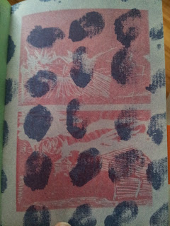

I found that Kessler's work, at least in this comic, is interesting in it's showcase of precise details in structure and building and a sort of controlled scribble used to draw nature. It creates an interesting parallel between the chaos of nature and the organized way we structure our lives and habitat. The collection is littered with these landscape images, some of  which are absolutely stunning. Overall, a neat little sketchbook that gives a good sample of Joe Kessler`s work.

Sunday, 16 August 2015

Jon Vaughn's Schwartz on the Schwartz: What We Are Like On The Inside

Inside My Head

What are we made of? Objectively, we know what a human body contains. We even know the chemical composition of our body. But what about our consciousness? What about our souls? What are they made of? What are we made of? I am not sure if any of us have any answers, but Jon Vaughn tries to explore this in Schwartz on the Schwartz.


Vaughn depicts the outline of human forms in various positions, but the only signifier of humanity is this outline. We recognize what humans look like, but we don’t see them from outside, instead we gaze into what the souls contained in their bodies might look like. Lines twist and turn into abstraction in the outline of the bodies we see. Souls are warped and we observe them, unable to ever grasp what we’re meant to see. We dig deeper and deeper into a depiction of human psyche that is completely wild. We see what looks like cerebral tissue, overlapping flesh and weird shapes. As one tries to unravel the meaning of the book, we are haunted by the mystery that surrounds this oddity. It stayed with me long after I put it down.

The comic, although short, is quite dense. As one tries to unwrap the meaning of this, we get to hold this nicely risographed mini-comic on beige paper with blue and black ink. It really is a neat little book. I doubt I’ll ever see any other comic from Jon Vaughn; I’ve had a hard time finding information on him online apart from his artist resume. In any case, I see an artist with a grasp of perspective and potential to turn into a great comic artist.

A subjective view of a soul

Sunday, 21 September 2014

Justine Reyes' Planet Claire: Abstraction, Celestial Bodies and Meaning


Ice Cold Planet

I visited San Francisco a few weeks ago and went on a hunt for the best comic book I could find. I was surprised to find a bin of floppies with lots of independent comics at Dog Eared Books. One of the coolest finds was a comic with three different covers called "Planet Claire" by Justine Reyes. Having no knowledge of what this was, I picked up a copy and read it later that night. Then a second time, and a third time. And a few more times the day after. Why did I read it so much and what is Planet Claire?

Planet Claire is a planet, a celestial body with human features. All that can be found on the planet is undeniably humanoid in it's own unique and strange way. Headless or limbless rests atop abstract background. 3-eyed busts are surrounded with stars. Rainbow-summoning Ballerina, naked women and creepy dolls are also present on it's surface. Then, it's over.


What interested me about this short comic, was the realization that I created meaning for myself and upon multiple readings, this meaning changed and evolved. I was consciously making an effort to find a different meaning with every read. As I browsed through the small and unkept bin from Dog Eared Books, I noticed that there were multiple colours for the cover of Planet Claire. I purposefully bought the blue cover. The pink cover seemed too bright and nausea-inducing with a fluorescent shade I just couldn't stomach. There was also a bright fluorescent yellow cover as well. I didn't pick it either as I use that kind of highlighter colour every day at work and am just generally sick of looking at it. So I picked up the blue cover and I can't help but noticing that it affected my reading and understanding of the book. I immediately associated the planet with ice-like qualities; it's human form frozen in its abstraction. A blue that evoked it's skies, it's ocean, and maybe a bit of melancholy. Perhaps I would feel differently had I picked a yellow cover. I may have attributed more warmth and happiness, maybe even some sunny attributes. 

In the end, meaning was established which rendered my questions meaningless. But the process to create meaning out of this book was exhilarating. It wasn't a phenomenal book, but a haunting one.

After all this, I was intrigued. I thought about the process of interpretation I went through (more on that below). I tried finding information on this book online and came up empty-handed. My only lead to know more was the email address at the back of the book. I contacted the artist and she was kind enough to provide some insight on the comic. She was able to explain that "Planet Claire" was a nod to women and girls. Through this book, she played with themes and icons involving females, which was something I didn't realize when reading. It was meant as an empowering comic for women as she explained: "women are not usually represented with such masculinity and power as often as men are."

Not matter what meaning or interpretation one will gain this book, it will be your own, guided through the lens of strange patterns. Check out Justine Reyes's book here.