Showing posts with label minis. Show all posts

Sunday, 16 August 2015

Jon Vaughn's Schwartz on the Schwartz: What We Are Like On The Inside

Inside My Head

What are we made of? Objectively, we know what a human body contains. We even know the chemical composition of our body. But what about our consciousness? What about our souls? What are they made of? What are we made of? I am not sure if any of us have any answers, but Jon Vaughn tries to explore this in Schwartz on the Schwartz.


Vaughn depicts the outline of human forms in various positions, but the only signifier of humanity is this outline. We recognize what humans look like, but we don’t see them from outside, instead we gaze into what the souls contained in their bodies might look like. Lines twist and turn into abstraction in the outline of the bodies we see. Souls are warped and we observe them, unable to ever grasp what we’re meant to see. We dig deeper and deeper into a depiction of human psyche that is completely wild. We see what looks like cerebral tissue, overlapping flesh and weird shapes. As one tries to unravel the meaning of the book, we are haunted by the mystery that surrounds this oddity. It stayed with me long after I put it down.

The comic, although short, is quite dense. As one tries to unwrap the meaning of this, we get to hold this nicely risographed mini-comic on beige paper with blue and black ink. It really is a neat little book. I doubt I’ll ever see any other comic from Jon Vaughn; I’ve had a hard time finding information on him online apart from his artist resume. In any case, I see an artist with a grasp of perspective and potential to turn into a great comic artist.

A subjective view of a soul

Saturday, 31 January 2015

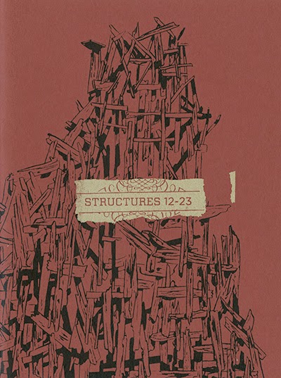
Structures 12-23: Vincent Stall on Decay, Environmental Destruction and Temporary Solutions

Decay and Solutions


Structures 12-23 by Vincent Stall is the second mini-comic in "Uncivilized Books" series "Structures". In this series, various artists are contributing various structures or objects in a mini-comic format. I haven't yet seen all of the minis (Structures 1-11 by Tom Kaczynski and Structures 35-45 by Patrick Kyle), although I read Structures 24-34 this May. I will seek out the other issues shortly to get a better perspective on this project. Most likely at TCAF 2015. 

Vincent Stall's structures begins with a sort of civilizational collapse. A tabula rasa of some sort, unexplained and incomprehensible, that left the world in ruins. From those ruins, a new grotesque architecture rises to once again stomp on the environment and impose it's will on nature. It was fairly interesting to see this mini. What we see from the beginning is the destruction and collapse of a world order. We can't quite make sense of how it happened. The story and clues aren't straightforward, much like the buildings that make up the world. From there we navigate a world of ruins. Destroyed buildings, ruins and decay are everywhere. What is fascinating is that the residents of this wasteland have been cannibalizing the land and chopping trees to make their temporary habitats. This becomes a recurring motif in the book as each structure is less sustainable than the previous one. One is left to wonder how useful this environmental destruction can really be. If this is what we are doing with nature, creating freakishly deformed houses, perhaps it would be best to leave it alone. And perhaps, going further in this reflection, our own structures are distorted and our mutilation and constant exploitation of nature would look like this to an outsider. 

Decay
Temporary solutions
In 24 wordless pages, Stall forces the reader to reflect on current environmental issues and the very nature of our exploitative ways and environmental destruction. I almost feel bad for reading this on what is, in essence, a tree`s corpse. This is an important book and Uncivilized Books should be very proud to publish such a strong and thoughtful experiment. I have been through this book more often than I ever thought I would. It was a fantastic trip through decay and was really thought-provoking. Excellent.

Wednesday, 29 October 2014

Yeah Dude Comics 2014 Subscription #5: Box Brown's New Physics

Masterpiece
After reading the previous Yeah Dude Comics (Future Masterpiece) left a bitter taste, I decided to wait a few days before cautiously diving into Box Brown's New Physics. I haven't read Brown's Andre the Giant yet, but I found his newest output from Retrofit Comics (the inprint he runs) to be quite phenomenal. I've thoroughly enjoyed Number 1 and Number 2. I wasn't expecting this pink mini comic to pack such a punch, let alone be one of my favourite comics of the year. Brown shows off his mastery of design, colour and storytelling and manages to create a poignant commentary on social media and it's ultimate consequence in this comics.

New Physics tells the story of Vern, a "desperate hedonist" who turned her life around through social media. She became a sort of social media guru and used it to create "New Physics", a sort of religious cult. Her following grows steadily until a fateful incident that ends the book on a surprisingly grim note. Do not be fooled by the lavish pink colour, this story is dark and disturbing. 

Social media consumption through inhalation
The story is a very interesting commentary on the modern use of social media. Brown imagines a futuristic world where everyone is connected through these see-through helmets that allows them to remain online at all times. Not only do the people of this world use social media constantly, they live and literally breathe it in. Their helmet emits these gases that allows them to be fully immersed in the connection. Imagine a food blog where you can not only see the food, but also inhale it's aromas.

The future setting and the rise of Vern also allows us to wonder if this is the logical end of Twitter and Facebook connections. If we are all connected and are all followers of Person X, reblogging, reposting, discussing Person X's opinions and thoughts, are we not preaching Person X's gospel? Is it that strange a concept to believe that we may see the rise of an organized religion purely through social media? In a striking moment, Vern addresses one of her "High priests" by telling him that he "is truly one of New Physics' Top 10 commenters". A modern religion for a modern age. 

Brown even manages to criticize the mindless consumption of false remedies and promises of salvation promoted by cult-like religions. The idea that, by spending,a bit more money, you'll somehow be more in tune with God is ludicrous. Vern capitalizes on this hawkish behaviour. As a follower, you can even spread the gospel yourself. BUY IT NOW: New Physics Apparel, New Physics Rebalancer. Buy the Concentration Tools of the Godhead. Find redemption through consumption of the New Physics branded products. What would a Torso Reimaginer do anyway?

Colour & Depth
Brown manages to make very efficient use of a very limited palette by using only black, grey, white and pink. The bright pink is used to create depth for the building or numerous vistas we see whether they be exterior or interior. It is also the colour of texts in social media (as in the previous image). It's also used as a stylistic element in clothing and on the New Physics Torso Remimaginer. It is a truly brilliant use of colour.

New Physics managed to become one of my favourite comics of 2014. I'll gladly read it over and spread the New Physics light to all. I'm a New Physics convert.

For further discussion, I've placed some articles on Social Media and Religion below should you wish to delve deeper into the very real possibility of the emergence of a web-based religion.

Sunday, 5 October 2014

Yeah Dude Comics 2014 Subscription #4 Josh Burggraf & Victor Kerlow's Future Masterpiece: Wasted Potential

Wasted opportunities
The worst I can say about the Yeah Dude Comics 2014 Subscription is that it's inconsistent. Some titles were fantastic (Find Me, Look for Me, New Physics), some were not so fantastic (Stoner Alien) and some were starting to show greatness (Iron Skull). This new release is unfortunately in the bottom tier. It's a real shame that it coincides with the release of Box Brown's New Physics (the 5th Yeah Dude Comics this year). New Physics is so vastly superior, it doesn't even seem to play in the same league. Let's take a look at Josh Burggraf & Victor Kerlow's Future Masterpiece

Where do I even begin with the story? The 15 year-old girl from The Jetsons is dating Bullwinkle. She is pregnant and they have a baby together. It turns out that the baby is none other than Stoner Alien and this is supposed to act as an origin story of sorts. He basically comes out of the womb and starts smoking cosmic pot. Oh, and a Teenage Mutant Ninja Turtle shows up to say `Cowabunga`. That's pretty much it. 

I guess it is the second part of a Stoner Alien Saga. It unfortunately exploits the same joke as the previous installment with diminishing returns. Using the joke "Wait...what?" to represent the alien's marijuana-filled baby`s brain unable to comprehend what is happening was fun when used in the previous issue, but here it is used so clumsily, it is embarrassing. I wonder what the goal of this exercise was. It feels like a lot of effort for what seems like a joke a couple of drunken (or stoned) guys made one night. 

The art is raw, even rough in places. The artists are trying to emulate the classic Hanna-Barbera style (flat characters, thick outlines). They are unfortunately having a really hard time maintaining consistency. Mainly, the horns of Bullwinkle and how they are connected to his head changes in almost every panel. 

As I said when I talked about Stoner Alien, maybe the Stoner Alien concept has a deeper meaning for those involved, but as a reader, I felt excluded from the jokes. The story is too thin, it feels like a writer's ego trip and the only jokes are references (and they only reference themselves). Better luck next time.

Tuesday, 9 September 2014

C.F's MERE: Not Reading, Experiencing

Feelings

I wish I could say I read C.F's Mere. I didn't read it so much as experienced it. One goes through a spectrum of moods, mindsets and emotions while navigating this book. It is unlike anything you have ever seen before.

Mere is a collection of short and mini comics by comic artist and musician C.F. (Christopher Forgues) published in 2012. The now defunct publishing company Picturebox collects 11 comics in this book. Most of them are attempts at genre (Sci-fi, crime, etc.). There are no main characters or storyline, just experiments with form, movement, narrative structure and emotion.

An introduction by Nicole Rudick opens this collection. I have absolutely no idea who she is and no credentials are provided. A Google search directs me to her Linkedin (I hope it's the right person) and it indicates that she is an editor for The Paris Review. Regardless of this confusion, her essay allows the reader to naviguate this storm.

It is followed by shapes and letters made to resemble buildings. There are beds, wells and drippings. It's followed by a short story about a man who is being hunted and is running away from someone. He inhales enough air to blow his pursuant's head clean off.

What am I experiencing? How to combine all of those fragments into a cohesive whole? This becomes interesting as we move away from the realm of comics and into the work of modern art. It's an experiment in developing new ways of seeing genre. It is abstract and the reader must create meaning as it goes. One must transcend what is on the page and the convention of comics. John Berger explains in Ways of Seeing, that the way we see things is affected by what we know or what we believe. We are also looking at the relation between things and ourselves. When we get to the section of the book about Comb (a sci-fi police officer) for example, one expects to see certain convention laid out on the page. Yet C.F forces you to reconsider those conventions at every turn.

As one digs deeper, we are treated to various stories (Cyborg, Frel, Crime, Comb, etc.). Mere manages to evade any classification of storytelling and comics. It is in many ways inexplicable; one must experience it to comprehend, and even then, our meanings will all differ.

Sunday, 3 August 2014

Yeah Dude Comics 2014 Subscription #3 Laura Knetzger's Find Me, Look For Me: Deep Psychological Troubles Camouflaged as Cute Aliens


Cutesy Melancholy

The third issue of the 2014 Yeah Dude Comics is absolutely stunning. A phenomenal foray into depression and despair camouflaged as an adorable alien story.

Laura Knetzger's Find me, Look for me, is the story of a young woman who finds a strange little alien in her backyard after a meteorite crashes nearby. She doesn't know where he comes from, but he looks pretty cute and defenseless. He looks a bit troubled and in need of support. She decides to adopt him and nurture him. She feeds him, teaches him and cares for him like you would a child or a pet. Although she sometimes wishes to leave everything behind and go away, she likes having this little alien around and will care for him for as long as it takes. This is the clear and obvious story, but there is also a terrible sub-text of loss, loneliness and quiet desperation. 

Distracted from her loneliness and desperation by the appearance of an adorable alien

The main character lives alone in the mountains. She has lost her brother at some point in the past and is now not only lonely, but deeply troubled. This loss has made life unbearable. She also doesn't feel the house is hers anymore, yet she can't bring herself to leave. Adopting the alien and caring for him fills a void and brings her some sort of redemption. We never know what happened to her brother, nor is it necessary to understand the trauma she has experienced. What we see is the agony and sorrow of this woman. Depression and sadness run deep underneath the cloak of cutesy alien.

The use of colour also emphasizes this dual notion of despair and adorableness. Grey and Blue are the only colours used in the book. The protagonists has "the blues". Blue signifies depression, tranquility, peace, calm and ice. She is frozen in those feelings, unable to escape them and come to accept those feelings as her existence. 

This book is short, but is dense and deep. At first glance, one could quickly dismiss it, but it would be a grave mistake. Laura Knetzger created an insightful voyage into depression within a really short page count. It is a creative look at sadness and despair. A brilliant short story that haunts this reader, in particular. 

Saturday, 2 August 2014

Horror Vaccui by Jono Currier - The Many Ways to Interpret Fear


I had a chance to pick up a copy of Jono Currier's  Horror Vaccui when I visited Montreal. I stopped by Drawn and Quarterly at 211 Bernard and I found this little gem. A collection of two horror short stories "The Story of the Flesh Hood" and "Tunnels".

I am not usually of fan of horror comics so it was very unlike me to pick up a horror book. I tried countless times to enjoy horror in comics and I have always been disappointed. It is difficult to accomplish proper horror feelings in comics. Since it is such a visual medium, a lot of artists have a hard time balancing the restrictions to achieve the desired feelings in the reader. Although horror has been a historically linked comic genre, I have always had a hard time seeing how it can be effiicient in sequential arts. Comic books are an inherently visual medium, one where you show and don't tell. Horror is a combination of frightening mood and moderations, menacing yet restrained feelings. Too much over the top gore or ridiculousness and the balance is lost. It must balance the untold and the revelations. It is a fine line to walk and not everyone is successful in doing it. That's not to say that there are no good horror comics. They are simply few and far between.

A typical shitty horror comic

Sam Alden: The Man that Dances in the Meadows
An exceptional, rare instance of a good horror comic book

I have nonetheless thoroughly enjoyed Jono Currier's Horror Vaccui to be quite excellent. I have wondered which of the two prominent interpretations of the horror vaccui expression this comic refers to. Is it that nature abhors emptiness, or is it a fear of empty space? Which way should we look at the text? There are many possibilities. Let's take a look:

Cenophobia
This is a concept linked to visual arts which consists of filling the entire surface of an artwork with details. A simple version of this would be "Where's Waldo". The entire page is filled with details, and it's also a game. Altough Currier's pages may have some panels which uses empty spaces, most if not all the panels are filled with white lines and the pages are filled with drawings. Nothing is left blank. The feeling of fullness is accentuated by the colour of the paper used. The use of black paper and white ink allows for a more dramatic effect. This colour technique, combined with the saturation of the pages, leaves the reader with a strange feeling of unease. The protagonist in the first story (The Story of the Flesh Hood) is unsure of what he experienced and neither does the reader. The excessive lines and rendering provides us with a surreal depiction of reality. The forest is filled with humanoid shapes and the sky is undulating, moving like waves over a man whose mind may well have been lost to the darkness long before we met him. 

The second story is even more related to this concept. Tunnels is completely filled with esoteric darkness, M.C. Escher style staircases, and extreme landscapes. Each panel is filled but it serves a purpose. It is the protagonist`s sensory overload. Madness and fear of the unknown twists and merges into a dark pit of despair. The reader can only gather the clues from these packed panels and is left to interpret for himself or herself.

Plenism

  • Nature abhors a vaccum
This is a concept related to physics which indicates that nature contains no vaccum because the denser surrounding material continuum would immediately fill the rarity of an incipient void. I didn't know this before I read the story, but had to refer to Wikipedia. In both stories, someone is gone and an emptiness is found and must somehow be filled. In the first stories, three bodies have been found and a killer is on the loose. These disappearances reveal a darkness; a long forgotten hole in a man. As he tries to uncover what once was, he discovers that this hole may be more than he can handle and that nature will find a way to fill this void, even if it means taking his life. 

In the second story, the tunnel is also a void that will be filled. A person finds a hole with a ladder coming out of it and, against all sense, he decides to go down. The tunnel cannnot be explained by senses. He discovers arcane figures and will eventually fall through the darkness and to his doom. This emptiness is unnatural and will be filled by both gravity and despair. It is not completely filled as the man is still alive, forever trapped in a universe that will never be let him free.
Brilliant & Terrifying

I did not think I would enjoy a horror comic and yet, here I am praising it. It is thoughtful, wonderful, brilliant and I absolutely recommend you seek out this artist and this book. I have been impressed on many levels. I am still unsure what to think of this book, what it means and how to read it. There are so many layers. It is frightening and riveting. I will read it many times over and so should you. Here is Jono Currier's website. Enjoy!

Saturday, 31 May 2014

Yeah Dude Comics 2014 Subscription #2: Skuds McKinley's Iron Skull: Effort Matters

Attempting Style
Here is the second review of the Yeah Dude Comics 2014 Subscription. This time, we have Iron Skull by Skuds McKinley.

Over 5 miniature pages, Skuds McKinley tries to emulate the feeling of a Paul Pope book. The book itself is quite short and I didn't find it very interesting. His futuristic style didn't really do anything for me. I found the most interesting part of the book was the short descriptive essay on the process he used for the final pages. It proved key to understanding both his style and approach to his art. He mentions "I've been doing comics for four years now, and the hardest thing I've had to battle is Paul Pope". Skuds seems to channel all of his efforts at recreating Pope's aesthetic rather than developing his own style. However, one can see in his brush strokes the quiet emergence of his own style. There isn't much to go on, but you can see it start to develop slowly. The way he draws movement in the punk rocker character and in the way he draws buildings. You can see an artist emerging into his own.

Unfortunately, there is too much emphasis on the style of the book. Translucent paper may be interesting, but it is not used in a clever way apart from being there. Empty pages are also scattered throughout to little effect. In spite of those issues, what shows clearly throughout is his skill as a storyteller. The story of the punk rocker is phenomenal; he remembers the album that changed his life and channels this energy into his own music. It is only one page and yet it is engaging and entirely too short. I didn't find it to be very interesting or meaningful, but I can recognize the talent of this artist. You can also see an artist coming to terms with his own limitations and trying to move past them. Skuds seems interested in developing his skills at improv comics and seems to be looking to define his own style, through a process of absorbing his icons`styles and throwing them back on the page with a touch of personal flair. It is very interesting to see. His efforts are earnest and I look forward to his other books.

Saturday, 24 May 2014

Yeah Dude Comics 2014 Subscription: #1, Pat Aulisio's Stoner Alein: One-note, One-joke

It is what it is

A few months ago, I helped to kickstart Pat Aulisio's project on Kickstarter to fund the 2014 project for his "Yeah Dude Comics(YDC)" anthology. I took a six issue subscription and I intend to review the books as they come in until the end of the subscription. Each book is created by a different artist. I have also received 3 other comics from them that are not part of the subscription, but from previous YDC efforts that I will also review once I have some time on my hands. Let's take a look at the first issue by Pat Aulisio.

Aulisio's Stoner Alien is as blunt as its title suggests. It's about an alien (the little green men kind) and his buddy, a teenage mutant ninja turtle. They basically just hang out together smoking and getting stoned. They both have a mundane existence working in a grocery store. The story here is irrelevant; it is coherent in the sense that we see one day in the life of those `dudes`, but it isn`t the point of the issue. It is a cipher for a comedy and a way to make stoner jokes. One of the jokes happens to strike a cord, but the other just fall flat. I guess comedy is subjective and a matter of opinion in the end... Maybe some of you will find it hilarious, though I doubt it. The book itself is short and spends 4 of it's 16 pages on the actual consumption of drugs and not exploring the more comedic aspects of it, as one would expect.

I did some research and discovered that this happened to be an old internet meme that you can find on tumblr. Poorly drawn and coloured, its filled with jokes; some great, some not so much. The big punchline being mostly"Wait...What?", representing a marijuana-filled brain unable to comprehend complex events. I think it's a bit lacklustre in effort and just doesn't translate well here. I don't know, maybe the concept had some kind of deeper meaning for Pat Aulisio. He certainly seems to excel in stoner comedy. His entire concept behind Bowman and it's sequels (Bowman 2016 and Bowman Earthbound) are stoner comedies. Bowman, however, is excellent. Aulisio channels Stanley Kubrick by way of Jack Kirby and throws in a smattering of Cheech and Chong. There are clever page designs, introspection and character development. It's amazing. In comparison, Stoner Alien has one joke about gravity being light. This series is nowhere near as interesting as Aulisio`s other comics and it's a damn shame. 

The Hijman body? Wait...What?

I'll also nitpick on this one panel where no one bothered to correct the lettering. It just seems unfinished. A work in progress. I expected more from Pat Aulisio. Meant to whet my appetite for more, this first glimpse of YDC just leaves a bitter taste in my mouth. I am still looking forward to the other books of the subscription. In the meantime, I'll go read Xeno Kaiju and remenisce on how good Bowman was.

Saturday, 17 May 2014

Structures 24-34: Michael Deforge and our national objects

Our National Structures

Returning from the Toronto Comics Arts Festival (TCAF) with an interesting mix of books, graphic novels and mini-comics. I'll try to review them all as soon as I can. Let's begin shall we.

Structures 24-34 by Michael Deforge is the third mini-comic in "Uncivilized Books" series "Structures". In this series, various artists are contributing various structures or objects in a mini-comic format. I haven't yet seen the previous minis (Structure 1-11 by Tom Kaczynski and Structures 12-23 by Vincent Stall), but I will seek them out shortly to get a better perspective on this project. 

Deforge's structures are a fantastic showcase of his artistic talent. I would recommend to anyone who have not yet done so to seek out his material, in particular, Lose, Very Casual and Ant Colony. In Structures, Deforge uses a familiar and recurring technique which occurs in many of his previous work, the juxtaposition of the descriptive, emotionless text and strange, inexplicable and esoteric drawings. He used this technique previously in Lose #4 in the story on Canadian Royalties and in Very Casual in The Spotting Deer short story. A clean description, almost like an encyclopedia entry, mixed with unusual, mystifying drawings that both enhances the words and confound the readers. There is a profound disconnect between what one read and therefore expects, and what one sees in the art. It is not however discomforting or disagreeable. It somehow manage to enhance the reading experience. It is engaging, fascinating.

Structures 24-34 is all about Canada's national objects, Chairs, fire places, stairs, etc. There is still a disconnect between what is written and what is illustrated, but it is stripped to it's most basic element. What we read is "National insert something". It allows the artist to expand on what is written and shatter expectations. This constant theme (national objects) allows for countless variations on the mundane objects and amaze the reader. This is very much an art book and it looks absolutely fabulous. 


Michael Deforge's "National Fire Place"
Abstruse...
Intriguing...
Exceptional...


I only wish the book was bigger. At 5.25 by 7 inches, this book is much too small to enjoy the art to it's fullest. Uncivilized books should be congratulated for publishing such a weird little experiment. I just wish I could gaze at this art on a larger page. It would have been impressive. Perhaps it will be if they ever collect the entire Structures.

But perhaps the size is not the point. I was basking in it's glory over 20 small pages. Marvelling at various shapes and forms and for a short little while, I transcended the realm of reality to stare at our national living room, our yards, our ladders, and it was magnificient.