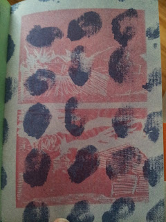
Breakdown Press is a very interesting publisher. Their output is varied, exudes quality and is incredibly well printed. I particularly enjoy the way they track the printing process of each of their publications. Due to their location in the UK, their comics are extremely hard to find in Canada, particularly in Ottawa. The one comic shop I`ve found that carries their books is in Toronto. I`ve somehow managed to come across a few of their books at TCAF or at the Beguiling and each one was excellent. Escape to the Unfinished is the latest of theirs that I was able to find. It's a collection of illustrations and short comics by Joe Kessler. While the comic is short (a mere 26 pages), it looks quite gorgeous. It falls flat in many places, mostly in it's attempt to tell a story about a kid being hunted by bullies for a wedgie (it's context-less and disconnected from the rest), but I can't fault it for looking nice.
 |
| Wedgie! The Comic |
The pages that prompted this entry were two drastically different pages back to back. One is precise, like an architectural depiction of a luxury mansion, whose plans have been lost to time; the other is abstract, a red page with liens and dots of white all around. I've placed the image of the two pages below. The clash between such precise drawings and such clear abstraction were simply incredible. I expected that this would cause a weird whiplash, but instead, they work extremely well together.
The comic also uses a great effect where the layers of colours printed on the pages make it looks like the paper is almost wax paper, or an acetate overlayed on top of a normal page. It's a neat trick that makes the drawing look like it's under an opaque layer of paper when it's really simply under another layer of ink. I don't recall having seen this before in other works.
I found that Kessler's work, at least in this comic, is interesting in it's showcase of precise details in structure and building and a sort of controlled scribble used to draw nature. It creates an interesting parallel between the chaos of nature and the organized way we structure our lives and habitat. The collection is littered with these landscape images, some of which are absolutely stunning. Overall, a neat little sketchbook that gives a good sample of Joe Kessler`s work.
 |
| Architecture + Abstraction |
The comic also uses a great effect where the layers of colours printed on the pages make it looks like the paper is almost wax paper, or an acetate overlayed on top of a normal page. It's a neat trick that makes the drawing look like it's under an opaque layer of paper when it's really simply under another layer of ink. I don't recall having seen this before in other works.
I found that Kessler's work, at least in this comic, is interesting in it's showcase of precise details in structure and building and a sort of controlled scribble used to draw nature. It creates an interesting parallel between the chaos of nature and the organized way we structure our lives and habitat. The collection is littered with these landscape images, some of which are absolutely stunning. Overall, a neat little sketchbook that gives a good sample of Joe Kessler`s work.


No comments:
Post a Comment