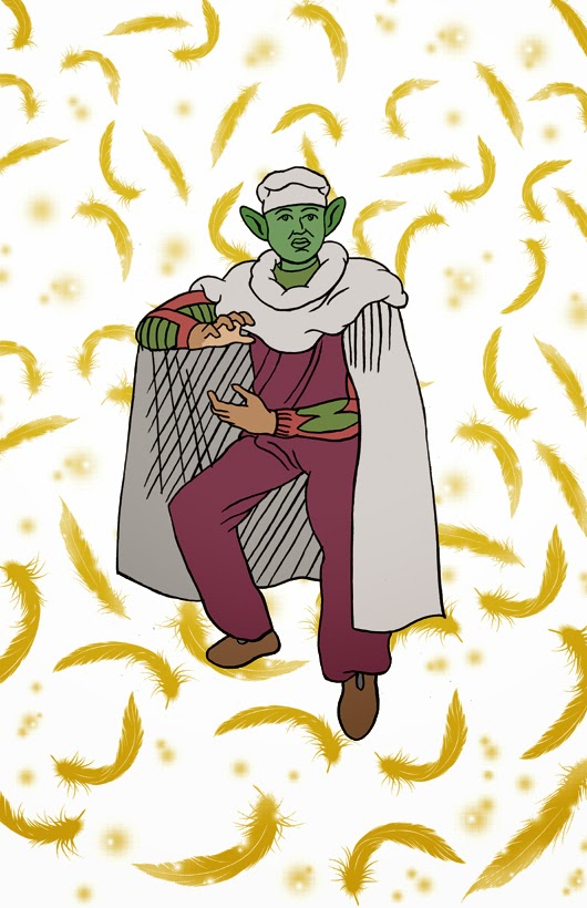
Here is the second review of the Yeah Dude Comics 2014 Subscription. This time, we have Iron Skull by Skuds McKinley.
Over 5 miniature pages, Skuds McKinley tries to emulate the feeling of a Paul Pope book. The book itself is quite short and I didn't find it very interesting. His futuristic style didn't really do anything for me. I found the most interesting part of the book was the short descriptive essay on the process he used for the final pages. It proved key to understanding both his style and approach to his art. He mentions "I've been doing comics for four years now, and the hardest thing I've had to battle is Paul Pope". Skuds seems to channel all of his efforts at recreating Pope's aesthetic rather than developing his own style. However, one can see in his brush strokes the quiet emergence of his own style. There isn't much to go on, but you can see it start to develop slowly. The way he draws movement in the punk rocker character and in the way he draws buildings. You can see an artist emerging into his own.
Unfortunately, there is too much emphasis on the style of the book. Translucent paper may be interesting, but it is not used in a clever way apart from being there. Empty pages are also scattered throughout to little effect. In spite of those issues, what shows clearly throughout is his skill as a storyteller. The story of the punk rocker is phenomenal; he remembers the album that changed his life and channels this energy into his own music. It is only one page and yet it is engaging and entirely too short. I didn't find it to be very interesting or meaningful, but I can recognize the talent of this artist. You can also see an artist coming to terms with his own limitations and trying to move past them. Skuds seems interested in developing his skills at improv comics and seems to be looking to define his own style, through a process of absorbing his icons`styles and throwing them back on the page with a touch of personal flair. It is very interesting to see. His efforts are earnest and I look forward to his other books.
A few months ago, I helped to kickstart Pat Aulisio's project on Kickstarter to fund the 2014 project for his "Yeah Dude Comics(YDC)" anthology. I took a six issue subscription and I intend to review the books as they come in until the end of the subscription. Each book is created by a different artist. I have also received 3 other comics from them that are not part of the subscription, but from previous YDC efforts that I will also review once I have some time on my hands. Let's take a look at the first issue by Pat Aulisio.
Aulisio's Stoner Alien is as blunt as its title suggests. It's about an alien (the little green men kind) and his buddy, a teenage mutant ninja turtle. They basically just hang out together smoking and getting stoned. They both have a mundane existence working in a grocery store. The story here is irrelevant; it is coherent in the sense that we see one day in the life of those `dudes`, but it isn`t the point of the issue. It is a cipher for a comedy and a way to make stoner jokes. One of the jokes happens to strike a cord, but the other just fall flat. I guess comedy is subjective and a matter of opinion in the end... Maybe some of you will find it hilarious, though I doubt it. The book itself is short and spends 4 of it's 16 pages on the actual consumption of drugs and not exploring the more comedic aspects of it, as one would expect.
I did some research and discovered that this happened to be an old internet meme that you can find on tumblr. Poorly drawn and coloured, its filled with jokes; some great, some not so much. The big punchline being mostly"Wait...What?", representing a marijuana-filled brain unable to comprehend complex events. I think it's a bit lacklustre in effort and just doesn't translate well here. I don't know, maybe the concept had some kind of deeper meaning for Pat Aulisio. He certainly seems to excel in stoner comedy. His entire concept behind Bowman and it's sequels (Bowman 2016 and Bowman Earthbound) are stoner comedies. Bowman, however, is excellent. Aulisio channels Stanley Kubrick by way of Jack Kirby and throws in a smattering of Cheech and Chong. There are clever page designs, introspection and character development. It's amazing. In comparison, Stoner Alien has one joke about gravity being light. This series is nowhere near as interesting as Aulisio`s other comics and it's a damn shame.
The Hijman body? Wait...What?
I'll also nitpick on this one panel where no one bothered to correct the lettering. It just seems unfinished. A work in progress. I expected more from Pat Aulisio. Meant to whet my appetite for more, this first glimpse of YDC just leaves a bitter taste in my mouth. I am still looking forward to the other books of the subscription. In the meantime, I'll go read Xeno Kaiju and remenisce on how good Bowman was.
I have to confess that I love reading books about sad people. More accurately, I love reading stories about miserable, mediocre people. The sadder they are, the more I like it. As long as they are actual characters and not just proxy for horrible misery and gloom. Think about Jimmy Corrigan, the smartest kid on earth. He is a sad, weak, middle-aged man whose melancholy and grief is a product of both his personality and his environment. He is caught in this wheel of unhappiness with endless questions about the meaning of his life, which he eventually tries to resolve. It makes for a fantastic read. He is a fully formed pathetic character and I loved him for it.
Annie the Cosplayer and her nameless friend, which I will refer to as "the photographer" for lack of an actual name (though she is apparently called Verti, according to Fantagraphics), are just as sad and miserable as one could hope for. Both are alone, longing to connect with someone. Their meeting and its connection to cosplaying proves key to understanding their relationship. They first meet at Otakon while Annie is cosplaying as Sailor Venus from the manga Sailor Moon. Cosplay is more than just about the costume. One also adopts the maneurisms, speech patterns, expressions and looks of the subject. It is about becoming the character completely. The cosplayer transforms oneself; acting and behaving like the character they are impersonating. Its obvious that someone dressed as Gambit or Magneto is not truly that fictional character, but it is deceitful nonetheless. This dishonesty permeates the entire book and their entire friendship. It is on nearly every page. Annie even carries a green screen in her own home. Her online interactions are always conducted under a false name (orlyman, lazymercenary, etc.). Special effects are even performed with a hidden camera `spy film`. The entire basis of their relationships is a lie.
The photographer is fascinated by Annie and they become friends, although it seems quite one-sided. Annie is not herself in their first meeting. She is Sailor Venus, played by Annie. She doesn`t just lie to others, but she is constantly playing a role with herself as well. She wants to be an actor and is extroverted when she is cosplaying, yet she is naturally shy and insecure. She displays mean characteristics and completely lacks empathy. The photographer is not any better; she longs for a deeper connection to someone and is willing to trade the truth for it. She maintains their deception until the end; the deception being that what they have is a friendship, and that they are making a film. It is through their deceptions of one another and the rest of the world that they are actually able to connect to each other. "You might see one of us and think we're delivering your mail, or waiting on your table, but we're actually acting and we've given you a bit part". But their friendship crumbles when one of them realizes that her false life leaves her feeling empty. The photographer meets a boy and wishes to form an honest connection with him. Annie discourages her, but she tries anyway. She lies, but it rings false. She convinces the boy with her lies, but she can't convince herself anymore. She is not Scarlet Witch, nor is she Daenarys Targaryen. He is not Magneto, nor is he Khal Drogo. They are who they are, and no one else. The sadness ends once she realizes that she does not need to lie to make a connection.
Just some guy
This comic book is too short and it manages to be more meaningful and more beautiful than most major releases. I didn't want it to end so abruptly, but the experience will stay with me for a long time.
Returning from the Toronto Comics Arts Festival (TCAF) with an interesting mix of books, graphic novels and mini-comics. I'll try to review them all as soon as I can. Let's begin shall we.
Structures 24-34 by Michael Deforge is the third mini-comic in "Uncivilized Books" series "Structures". In this series, various artists are contributing various structures or objects in a mini-comic format. I haven't yet seen the previous minis (Structure 1-11 by Tom Kaczynski and Structures 12-23 by Vincent Stall), but I will seek them out shortly to get a better perspective on this project.
Deforge's structures are a fantastic showcase of his artistic talent. I would recommend to anyone who have not yet done so to seek out his material, in particular, Lose, Very Casualand Ant Colony. In Structures, Deforge uses a familiar and recurring technique which occurs in many of his previous work, the juxtaposition of the descriptive, emotionless text and strange, inexplicable and esoteric drawings. He used this technique previously in Lose #4 in the story on Canadian Royalties and in Very Casual in The Spotting Deer short story. A clean description, almost like an encyclopedia entry, mixed with unusual, mystifying drawings that both enhances the words and confound the readers. There is a profound disconnect between what one read and therefore expects, and what one sees in the art. It is not however discomforting or disagreeable. It somehow manage to enhance the reading experience. It is engaging, fascinating.
Structures 24-34 is all about Canada's national objects, Chairs, fire places, stairs, etc. There is still a disconnect between what is written and what is illustrated, but it is stripped to it's most basic element. What we read is "National insert something". It allows the artist to expand on what is written and shatter expectations. This constant theme (national objects) allows for countless variations on the mundane objects and amaze the reader. This is very much an art book and it looks absolutely fabulous.
Michael Deforge's "National Fire Place"
Abstruse...
Intriguing...
Exceptional...
I only wish the book was bigger. At 5.25 by 7 inches, this book is much too small to enjoy the art to it's fullest. Uncivilized books should be congratulated for publishing such a weird little experiment. I just wish I could gaze at this art on a larger page. It would have been impressive. Perhaps it will be if they ever collect the entire Structures.
But perhaps the size is not the point. I was basking in it's glory over 20 small pages. Marvelling at various shapes and forms and for a short little while, I transcended the realm of reality to stare at our national living room, our yards, our ladders, and it was magnificient.
Farel Dalrymple's It will all hurt is a fantastic comic book. A dreamscape set on a post-apocalyptic earth. A shapeshifter, a wizard, an astronaut, a martial artist, a community forming slowly. A confrontation between them and a Red Sword Wizard named Every will happen eventually, but it is hardly the point of the book. It is a dream we delve into.
Dalrymmple explores themes of loneliness, friendship and adventure. Dalrymple's art, his watercolor landscapes and esoteric characters, is fabulous and delightful to admire. And perhaps this is what truly matters, the journey being more important than the destination. There is a strong feeling of unease for the characters as we know the world is dangerous, filled with rules we do not fully understand yet. The unknown is mysterious and strange. This land is perilous and risky. The adventurers are brave and audacious. It is fascinating.
I have been lucky enough to acquire a print copy from Study Group a few months ago and have since contributed to their kickstarter to obtain the second copy of It will all hurt. It is a fantastic accomplishment and I'm glad I've been able to gaze upon such a wonderful book. The print edition of #1 contains the first two chapters and chapter 3 to 5 are already available on the Study group website. I highly recommend it for any science-fiction and adventure fan. This book is thrilling.
Dotter of her Father's Eyes is a graphic novel written by Mary M. Talbot and illustrated by her husband Bryan Talbot. It is fundamentally two biography narratives told together. We follow the life of Lucia Joyce, the daughter of James Joyce as well as the life of the author Mary M. Talbot, who is the daughter of Joycean scholar James S. Atherton. The author juxtapose her story to that of Lucia Joyce's tumultuous life from her birth in 1907 to her schizophrenia diagnostic in 1935 where she was placed in a psychiatric institute and where she spend the rest of her life. Social and family expectations, gender politics and historical context eventually created a storm of tragedy for Lucia Joyce. This story is told conjointly with that of author Mary Talbots' life.
On many levels, this is a fantastic collaboration between the author and the artist. The life of Lucia Joyce is riveting and makes for a fascinating read. However, the author's biography feels like an attempt at exposing how rude, distant and mean her father was to her all those years. All the slights, fights and disappointment are portrayed in depth, almost to the point of exhaustion. Upon first reading, it felt like a long book on self-pity and a exhaustive account of wallowing in one's pain. It is not a negative point per se, but since it is juxtaposed to Lucia's story, the whole group of readers at the book club felt that this was an attempt to add importance to her own story by comparing and contrasting to her own life. In a way, this is isn't completely false, but I do not believe that it is the only reason. Mary Talbot's life as described in the book is nothing but ordinary, neither tragic, nor particularly exciting, just a life lived. The only thread connecting the two women seems to be their father and the traditional family upbringing view that their father adopted.
Talbot's approach to biographic work is reminiscent of the modern French biography.This current has been quite important in French Literature over the past decade or so. The biographer select a subject, sometimes important, sometimes not, and study it. It becomes less of a straightforward tale on the subject and more of an exploration of various topics (cultural, political, , time period, etc.). This effectively blurs the lines between biography, essay and fiction. Emmanuel Carrère's "Limonov", Pierre Michon "Vie minuscules" or Benoit Peeters "Derrida: A biography" are good examples of this type of modern French biography. Another good example is Benoit Peeters second book on French philosopher Jacques Derrida in which Peeters chronicles the process of writing the first biography of Derrida, his life during the process from research to publication. He also talks about Derrida, almost as a second thought, even though he is the reason this book is being made in the first place. Talbot use a similar tactic while writing the book. She uses juxtaposion as a mean to contrast two narratives. It also allows her to explore the themes she wishes to such as the importance of the father, family trauma, gender and failures. She blurs the lines between autobiography and fiction.
Style and colors reminds us throughout the book that even though the story wishes to create a link between the two women, they are indeed quite different and must be seen as such. There is actually three different styles throughout the book. The opening pages shows the Mary and her husband Bryan in the present, the colors are bright, realistic and well defined. They are the now and therefore looks the most similar to reality. From this, we are led to flashback of Mary's childhood. The pages are in shades of grey and beige and accented by dash of colors in very specific points. The grey-beige scheme could represent a mundane, uneventful life while the dash of colors is used to represent either important objects, to evoke emotions or simply to accentuate contrast.The traditional panel grid is also absent from any pages in the past, allowing for a much more fluid page layout which Bryan Talbot uses effectively.
The present and the past
Dark, cold blue, greys and blacks are used when it comes to Lucia Joyce's story. The color scheme represent the unnatural nature and drama of Lucia's life. They come from different eras, both from a cultural and societal point of view. Lucia Joyce lived during the First World War, the roaring 20's and Second World War while Talbot was born long after the war was over. She lived a life of peace, privileges, and emancipation and these are just a few examples of what separates the two women.
The colors are not the only trick used to differentiate the two narratives. A careful attention has been place on the characters eyes. Characters in Mary Talbot's era (past and present) have single dots in lieu of eyes, whereas characters in Lucia Joyce's era have much more developed eyes. Comparing it to the cover page, where Mary Talbot has two dots, we can see the difference. Surprisingly, the book club members did not caught on this point during our discussion.
The eyes
My only problem with the book as to do with one page which was blatantly plagiarized. My favourite movie of all time is "The Red Shoes", a 1948 film by Michael Powell and Emeric Pressburger. It has been released by Criterion and here is their description of the movie: Red Shoes, the singular fantasia from Michael Powell and Emeric
Pressburger, is cinema’s quintessential backstage drama, as well as one
of the most glorious Technicolor feasts ever concocted for the screen.
Moira Shearer is a rising star ballerina torn between an idealistic
composer and a ruthless impresario intent on perfection. Featuring
outstanding performances, blazingly beautiful cinematography by Jack
Cardiff, Oscar-winning sets and music, and an unforgettable,
hallucinatory central dance sequence, this beloved classic, now
dazzlingly restored, stands as an enthralling tribute to the life of the
artist.
Now why is this relevant to the book? Well, one exchange betweenLucia Joyce and Samuel Beckett has been lifted wholesale from the movie. Not just any, but one of the most important passage. This young ballerina discuss with the ruthless impressario and she expresses that art, is just as important as life. For comparison purposes, I've included the youtube clip of the movie and the panels in question.
And three panels
These three panels took me out of the book completely. I have done some research, but I have not been able to find any evidence that this is historically related to Lucia Joyce. If anyone has any idea on the matter, please feel free to write it in the comments.
Aside from this slight issue, the book is fantastic and I'd recommend it. The entire book club agreed that this book was a very good read. It is short, but incredibly dense. It,s an interesting exploration of gender issue, family trauma, life failures and color design. Mary and Bryan Talbot have created a captivating book. The Ottawa Comic Book Club unanimously recommend the book.
It is with great pleasure that I introduce my mission statement for this blog. My goal is to provide readers with a good source of critical analysis and reviews of indie-alternative comics as well as mainstream comic books and graphic novel, both current and past.
Why "Barbed Comics"?
I tend to be quite harsh and critical when it comes to my appreciation of comic book and most cultural products. I have been loving comic books since I was a kid and I love the medium. I believe that it is impossible to be interested in something and not develop a critical point of view on it. It seemed a propos to used "barbed" as it means "cutting" "biting" "critical" "harsh" "unkind" "sarcastic" and I'm also a bearded man "barb" seemed relevant.
What will this blog look like?
At this point I don't know, as I have never had a blog previously. Bear with me, I'll do my best. I will point out the bad as well as the good in the books selected and I intend to be as honest as possible with what I will review.
The book club
I am part of a comic book book club which convenes 6 to10 times a year. I'll bring feedback from the group on the books we review. The book title will be be announced in advance if you wish to read it and comment.